data_raw |>
  mutate(something) |>
  group__by(something) |>
  summarise(something)
A week or so ago I was listening to a podcast about Ducklake, the new table format by DuckDB, and started thinking if it can be used from R, specifically to mimic what would one do on cloud providers such as Databricks.
dplyr and friends are mostly about cleaning and summarizing data, and the lake(house) idea is mostly about the so called ‘medallion architecture’ where data moves from raw and messy, to clean and validated, to business ready. So it’s kind of like:
But why, you may ask? Well I think most data is not big data, but all data goes through this same process of cleaning and summarizing, so why not try and use some of the nice ideas to add to an R workflow.
Note: If you are thinking about following through this post this is a good time to do install.packages('duckdb') if there is not a binary distribution for your system. It takes a while to compile it.
OK. This is what we will try to do next:
Set up a Ducklake;
Write some data to it;
Visualize relationships among tables.
Setting up a Ducklake
Assuming you have opened a new Rstudio project with git enabled, and the duckdb package is installed on your system setting up Ducklake is as follows:
library("duckdb")

con <- dbConnect(duckdb(), dbdir=":memory:")

dbExecute(con, "INSTALL ducklake;")

dbExecute(con, "ATTACH 'ducklake:metadata.ducklake' AS r_ducklake;")

dbExecute(con, "USE r_ducklake;")
This creates a in memory duckdb database, installs the ducklake extension and then creates the ducklake on disk. In your project you will see two files: metadata.ducklake and metadata.ducklake.wal. The first one is a duckdb database with a different extension and the second is the write-ahead log that duckdb uses to manage the metadata.
If we close this connection (but if you do this remember to run the above again before continuing below:
dbDisconnect(con)And then open the ducklake file with a database browser, for example the duckdb cli:
$ duckdb -ui metadata.ducklake you will see that it is a database with the tables as described on the specification overview for the table format.
Writing data to the ducklake
Next I will pretend that the mtcars dataset needs to be cleaned and aggregated. There may be a better datasets to give this example, but it is simple to see the steps like this. I am also using SQL but same can be achieved with dplyr or anything handy in R:
# Bronze: raw data
dbWriteTable(con, "bronze_mtcars", mtcars)

# Silver: filtered / cleaned
dbExecute(con, "
  CREATE TABLE silver_mtcars AS
  SELECT *, (mpg/mean(mpg) OVER()) AS mpg_norm
  FROM bronze_mtcars;
")

# Gold: aggregated summary
dbExecute(con, "
  CREATE TABLE gold_mtcars AS
  SELECT cyl, AVG(mpg) AS avg_mpg, AVG(mpg_norm) AS avg_mpg_norm
  FROM silver_mtcars
  GROUP BY cyl;
")
In the medallion architecture the first layer, the raw data, is called bronze, and in this case we just write the mtcars as is.
Then the second layer, the silver layer, we sort of clean these data. I have no idea if normalizing miles per gallon makes sense, but hey why not.
The final layer is about an aggregate summary, a gold layer, so group by and summarize is what is happening there.
If you run the above in your demo project you will notice new files created:
[metadata.ducklake.files]$ tree
.
└── main
    ├── bronze_mtcars
    │   └── ducklake-01996884-c393-7134-bee0-cbffb31e19c7.parquet
    ├── gold_mtcars
    │   └── ducklake-01996884-c3cd-7ae6-bcaa-0b69196040cb.parquet
    └── silver_mtcars
        └── ducklake-01996884-c3b5-7d9d-b9f8-05e3c8377bee.parquet
This is ducklake keeping track of your data in parquet format.
Next we need to make something to track the relationships between the tables. For now i think this is not supported in ducklake(v.0.0.3), but probably will be in the future.
Ideally the following should be executed as each table is written, but for sake of example it is below:
dbExecute(con, "
CREATE TABLE IF NOT EXISTS ducklake_lineage (
  parent_table VARCHAR,
  child_table  VARCHAR,
  created_at   TIMESTAMP,
  description  VARCHAR
);
")

# After creating a silver table from bronze
dbExecute(con, "
    INSERT INTO ducklake_lineage (parent_table, child_table, created_at, description)
    VALUES ('bronze_mtcars', 'silver_mtcars', NOW(), 'normalization / filtering');
")

# After creating gold table from silver
dbExecute(con, "
    INSERT INTO ducklake_lineage (parent_table, child_table, created_at, description)
    VALUES ('silver_mtcars', 'gold_mtcars', NOW(), 'aggregation');
")
Let’s imagine that we have done some more transformation and maybe created 2 more silver tables and one more gold table. Of course, the decription should be updated to make more sense:
dbExecute(con, "
    INSERT INTO ducklake_lineage (parent_table, child_table, created_at, description)
    VALUES ('bronze_mtcars', 'silver_mtcars_2', NOW(), 'normalization / filtering');
")

dbExecute(con, "
    INSERT INTO ducklake_lineage (parent_table, child_table, created_at, description)
    VALUES ('bronze_mtcars', 'silver_mtcars_3', NOW(), 'normalization / filtering');
")

dbExecute(con, "
    INSERT INTO ducklake_lineage (parent_table, child_table, created_at, description)
    VALUES ('silver_mtcars', 'gold_mtcars_2', NOW(), 'aggregation');
")
Visualize relationships among tables
Since digging trough the parquet files to see what the relationships between the tables are does not make much sense, we can use some of good old ggplot2 and friend magic to visualize that.
library(igraph)
library(ggraph)

edges <- dbGetQuery(con, "SELECT parent_table AS from_table, child_table AS to_table FROM ducklake_lineage")
g <- graph_from_data_frame(edges, directed = TRUE)

ggraph(g, layout = "tree") +
  geom_edge_diagonal(arrow = arrow(length = unit(4, 'mm')), end_cap = circle(3, 'mm')) +
  geom_node_point(shape = 15, size = 8, color = "steelblue", fill = "lightblue") +
  geom_node_text(aes(label = name), vjust = -1.2, size = 4) +
  coord_flip() +
  scale_y_reverse() +
  theme_void() +
  ggtitle("DuckLake Medallion Lineage")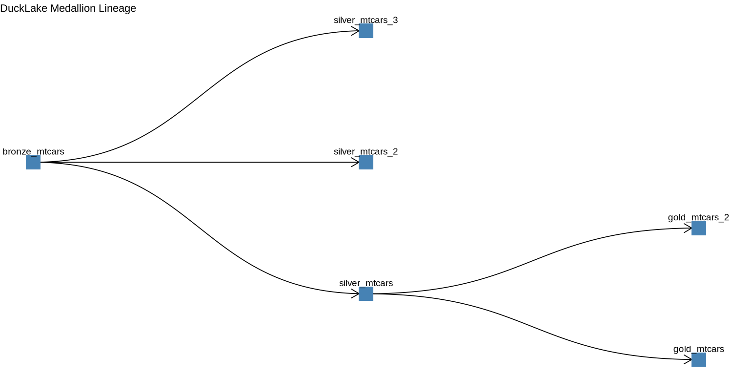
This is the sort of a thing you get to see under the lineage in Databricks’ Unity Catalog, although not as elaborate. However, a proper ggplot2 wizard may succeed in making duplicating that view.
You can imagine having this plot as part of a Quarto report or a Shiny app with some interactivity to keep track of the transformations that happen to the data you are managing.
Summary
As we set out in the beginning we set up a Ducklake with R, wrote some data to it and visualized relationships among tables. While the example is trivial, I think it is obvious that this could be a useful approach for managing local pipelines and for prototyping things that could run on the cloud.
For local pipelines in particular, I can see this approach been used with something like {maestro} to orchestrate a data pipeline.
The code above is available as a gist.